Friday, 15 March 2013

Q7) Looking back at your preliminary task, what do you feel you have learnt in the progression from it to the full product?


 The first product show my preliminary task which we started at the beginning of the year.


From beginning the year the most important thing I have learnt is conventional feature to magazines. How to use new technoliges such as photoshop, dafont.com, picmonkey etc. Which increased and enhanced my product making it look more professional. The reason we did the preliminary task was so we could grasp how to use Photoshop and make mistakes on the college magazine instead of making them on our final product. I think this was useful because looking back at my preliminary task i can tell that i have expanded my understanding of Photoshop and learnt many techniques which have been shown in my final music magazine. I have also understood what conventional features you would put on a magazine and how and where they would be placed on the magazine. The font for my preliminary front cover is all the same therefore certain bits don't stand out. It hardly conforms to any of the features you would expect to see on professional magazines. For example there is no main cover line that links with the main image, doesn't stand out either. Plus the masthead isn't anything different to the rest of the writing.

If i could change anything on my preliminary task i would mainly focus on following typical conventions. I would do this by sticking to one photo on the front cover and experiment with lots of different fonts and colours to be more creative. I would fill up the empty spaces to make the magazine look more interesting because from looking at it now i can tell that there would me many readers willing to buy the magazine as it is not eye-catching enough. The main photo would have a direct gaze with the audience to capture their attention. I would certainly not overlap the two photos on the cover as it looks messy.  I think from gaining more understanding of Photoshop it showed a big improvement to my product. I also learnt how to follow conventional features before beginning my main product. Overall i realised in order to sell the magazine it would have to look professional.

Conventions i missed out on:
Main cover line
Main article image

With Photoshop i have learnt how to:
  • change hair colours and colours on the pictures. 
  • Removing Backgrounds
  • Importing pictures inside text
  • Airbrushing
  • Placing pictures on top of one another 
  • Editing faces


Thursday, 14 March 2013

Q6) What have you learnt about technologies from the process of constructing this product?

There where several pieces of technology I used in order to make my product. These were:

  • Publisher
  • Photoshop
  • Picmonkey.co.uk
Overall the main software that i used the most to produce my magazine was Photoshop. Photoshop helped me too give a professional look to my magazine as I could edit it exactly how I wanted and experiment in different ways with it.

When editing my photos originally

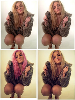
I used Photoshop. With Photoshop i learned many qualities on how to edit my photo. I learnt how to airbrush the skin on the picture (see all images) and on how to change the colour of hair (see image 3). i took the models pose gave i direct gaze to the audience.  Therefore i decided to change the colour of the eyes to catch the audiences attention when reading or looking through a magazine (see image 2). Photoshop also managed to correct a few problems i had with my photos. One problem i had was the nails on my model. She was wearing nail varnish which had been chipped so in order to make it look more professional i used the clone tool to fill in the rest of the nail (see image 2). Another problem i had was some of the shadows that appeared on the photo. On my first photoshop with my friend laura we used a fan to create a windswept pose. Unfortunately the shadow of the fan appeared on the photo. In order to get rid of it i used the clone tool again (see image 1). I also adjusted images by going on the drop bar edit tool and adjusted the tones, contrast etc. to make the image create an atmosphere and on some make them look more professional (see image 5). Another thing i learnt on photoshop was how to merge to pictures together by putting on layer on top of the other and changing the opacity of the first layer so the second one appears (see image 3). To make some photos more interesting i changed the background of some photos which was also done by using layers. On one of them i added an american flag style background to go along with my article (see image 4). To also match my article i photo-shopped an american flag shoe onto my model, again done with the use of layers (see image 6).


OTHER EDITS


Here is some step by step pictures of the process's i used to edit my pictures on photoshop:

IMAGE WITHIN A TEXT
CHANGING HAIR COLOUR
ADDING A BOOT


Wednesday, 13 March 2013

Q4) Who would be the audience for your media product?

My chosen target audience was aimed at young teenagers and university students. The reason for this is because the type of music produced by the RnB genre focuses their songs and albums to this market of people. The celebrities featured in magazines of this genre also come from the same age group as the audience which creates role models for the audience which they can also relate too. This way with a magazine about artists from the same age range they can take a break from their life and read about the artists. From researching this genre it shows the gender of the audience is mixed and is suitable for both. However there is a tiny increase in sales from males then females. To help me with picking the right conventions and features for this audience I created my own reader profile.


Before I started constructing my product I did research on demographics which helped me choose which grading system my magazine would go under. This helped me with pricing, the content and when the issues will be released. I also looked at already released magazines of this genre to see how much they would cost and found out what audience they aim their magazine at. 


Question 1) What genre do you think my magazine represents?
Question 2) What type of audience would you say the magazine is aimed at?
Question 3) What do you think is eye catching about the magazine cover?
Question 4) If you could change something on my magazine what would it be?
Question 5) Does my housestyle match throughout all 3 of my product and How? Also, overall do you think my magazine follows conventional features?
Question Responses from: 
Katie Smith 16
David Cook 18
Courtney Newsom 17


survey media kris by s0014768 on GoAnimate

Animated Presentations - Powered by GoAnimate. Media survey katie by s0014768 on GoAnimate

Animation Software - Powered by GoAnimate. Media survery David by s0014768 on GoAnimate

Animation Software - Powered by GoAnimate.

Tuesday, 12 March 2013

Q3) What kind of media institution might distribute your media product and why?


Q2) How does your media product represent particular social groups?

Before i began my product i did research on what type of celebrity's would feature in my magazine and what representations are of men and women in this particular genre. I did this by looking at the singers music videos, which can be seen in my research at the beginning of my blog. In conclusion to my research it represented the singers glorifying violence and gun crime. Showing wealth through gold, bling and cars. When we think of bling and lots of money in this particular genre we see men as 'gangstas'. Representation of women are seen as sex objects, slim figures, a lot of makeup to appeal to the male audience. Yet female celebrity's such as Nicki Minaj which a lot of my research was focused around was seen as bad girl, a female version of male artists yet still showed as a sex symbol. So for my magazine i tried to recreate this persona with my leading female artist. So in this case my model represents a sex appeal with her clothing choice being revealing which shows a deconstruction of the clothing below:

I also did this for a few other of my photo shoots:
The reason i chose the first style over the second one was because it matched the particular social group i was trying to recreate with consideration to the genre of my magazine. It was more relevant to the genre and would sell more to the males audience.

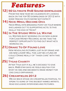
The features on the contents page like the nicki minaj story represents the female artist as being a diva which is what a lot of them are represented for from all the wealth. It also shows she can be a violent character which is also what we expect, as a lot of RnB singers glorify violence almost promoting it. Therefore the readers who we except to read and enjoy this magazine are the younger generation as it is not something we would expect an older women or men choosing to be interested in.This links with my demographics which i also used to research my audience and this is the conclusion i came up with at the end:

'For my magazine I have chosen my magazine to be aimed at an age group of 16-20 year olds where it will apply to both sex. With this group of people being quite a young age group it means a lot of them will be at university, education or just starting out in the workforce therefore the audience will be in band D/E. The reason for choosing an audience of this age is because a lot of the celebrity's that are part of the RnB genre are in their 20’s so the audience will be able to relate and are more interested in celebrity's that are the same ages of them. To the male sex, women in the magazine are also seen as sexy from this genre so therefore I  will have to put young and good looking artists in order to sell the magazine. An example of a typical female celebrity found in magazines of RnB genre would be Nicki minaj However for females they will look at the female artists as role models. I took a mini survey to see how much this age group would pay for the magazine. From looking at results from my surveyors  it said that they would pay quite a lot for the magazine but it would have to come out monthly in order for them to be able to afford it. I also made sure to check other prices for magazines of this kind and they were all priced around £3.99, so I thought I should stick with a conventional price however feature on average 60 pages.  In my magazine I will feature tickets to live festivals in the UK that a lot of young people like to attend. Some examples will be cream fields, tomorrow land and V festival. I will do this because it will interest young readers and this audience to buy my magazine. Also with them scoring band D/E in the grading system it may be a once in  a life time opportunity with them not being able to afford tickets to these festivals with them being so expensive and with them not having a very big income from having to pay University fee’s etc.' (previous work already on blog.) 

My magazine is aimed at the D/E band. From knowing this i had to make sure my product also represented these people. This is because a lot of RnB singers such as drake, 50 cent etc. where once living the same life as people from this group so they can relate. Usually people of the D/E band are seen as working class or lower skilled working class who fund off the welfare state. In society these people are stereotyped negatively, also RnB singers a stereotyped negatively. In a lot of their songs it speaks about fighting, sex, girls etc.  therefore the age group would be aimed at younger people and we wouldn't expect old people to be interested in these type of articles. They also spoke about how they lived in poverty. Here is a breakdown of the celebrity's featured on my magazine and some of the lyrics they wrote about their lifestyles which is incorporated into their songs. (see below) My magazine by females being upfront and males as being strong outlaws to society.  Yet my magazine also needs to represent role models that the audience can look up too. This is shown in the example of an article on my contents page called 'Tygas Charity'.


Q1) In what ways does your media product use, develop or challenge forms and conventions of real media products?


My final products show continuity through each one mainly by that they each feature an American flag style on each page which links with the main article of the double page spread. This shows that they are all part of the same magazine. The cover story’s also matching the inside of the contents page about the 2 celebrity’s; drake and Nicki. The font impact was used throughout all of my products however not so much on the double page spread. This font creates the link between the contents page and cover page which helps create the house style, I also put the headline on the double page spread in impact just so that I had some evidence of it coming from the same magazine. I have also used a lot of colours on all 3 products. This shows that my magazine is loud. Most of my models have bright hair colours; I did this to represent celebrities like Nicki Minaj who would be expected to be seen in this magazine. My main artist was also seen throughout my magazine with this bright blue hair. The main reason for the hair being blue was to match the blue on the American flag which has relevance to the feature article on the front. On each page it had the masthead Deuce written exactly the same way every time it appeared, even on the double page spread. This made it clear to the audience that it was still part of the magazine and followed conventional features as other magazine would also use there logo when mentioning the masthead. The contents page and layout also follow the same style.